The emergency >
The lights go out. You're standing in an unfamiliar building. You're looking for the exit, the toilet, room 12. You see nothing. In that moment most wayfinding systems are just decoration. They speak to the eyes alone. For you, an exceptional situation.
> Here, it's everyday life.
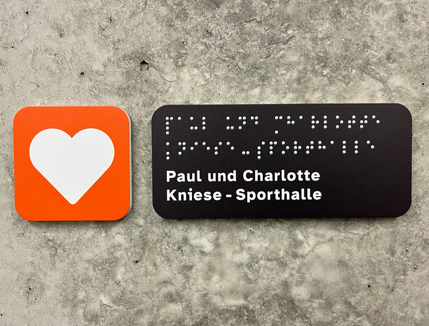
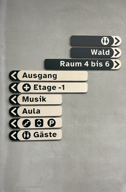
At the Nikolauspflege's Betty-Hirsch School, every school day begins like this. Blind and partially sighted children learn here. So do children who process stimuli differently — with ADD, for instance. We built a wayfinding system that works without eyes. Not in spite of that. But because it never counted on them in the first place. (By the way: it won the IIIDaward for this. More on that below.)
A sign you can only see > is a myth.
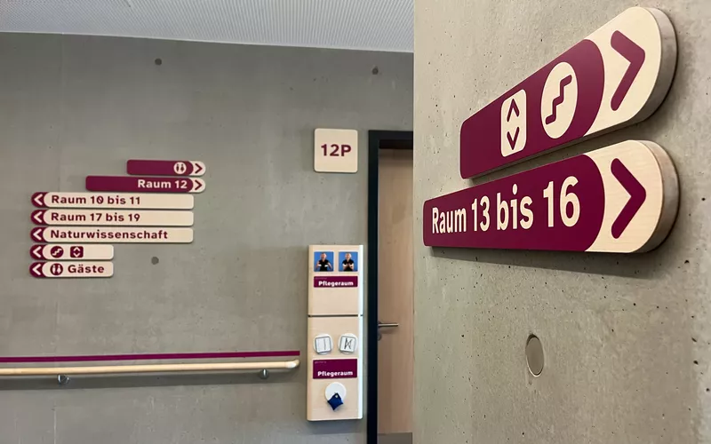
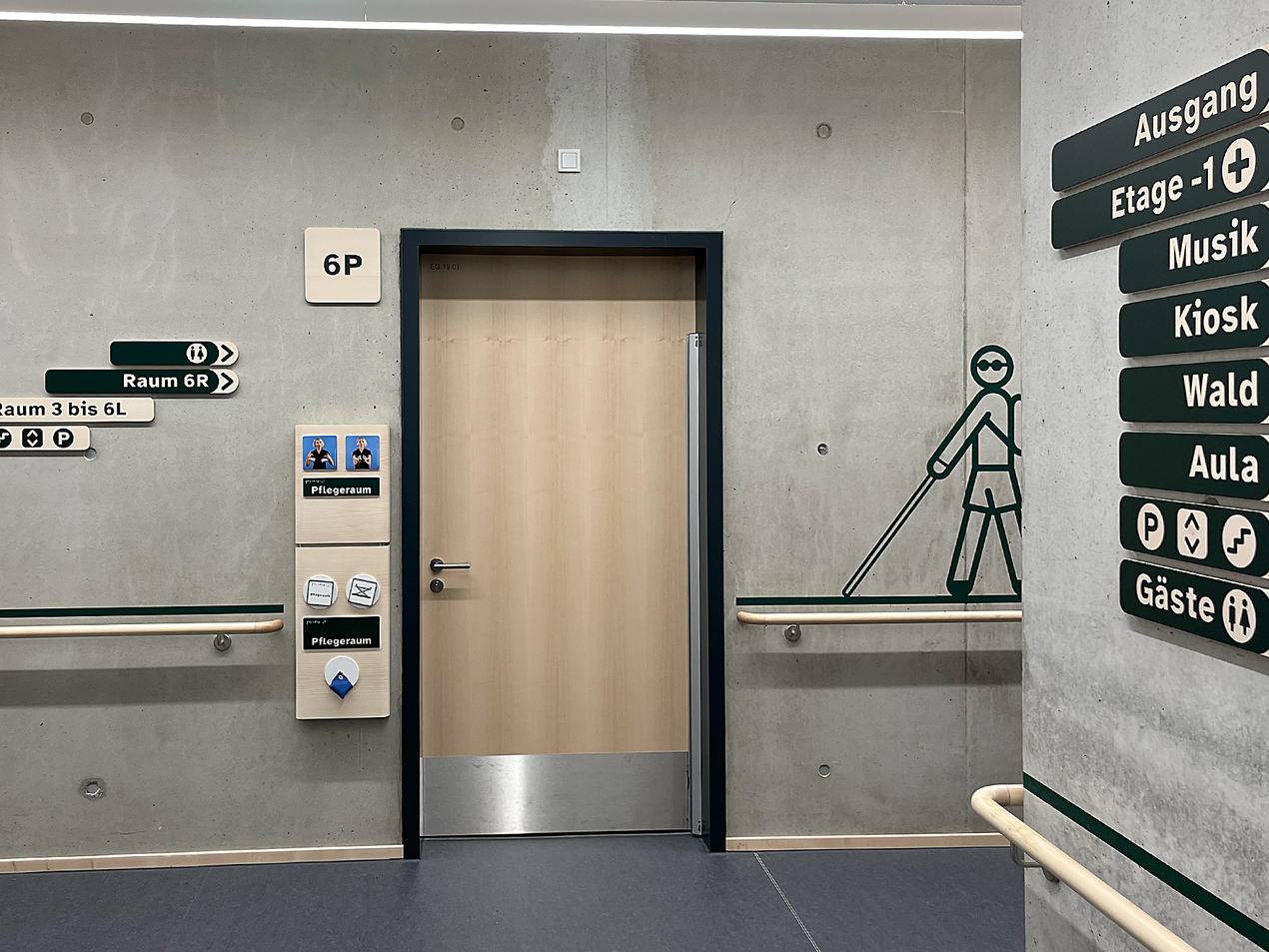
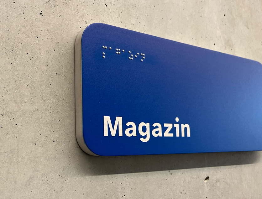
That's why the rulebook sets out the two-senses principle. Every key piece of information must arrive through two senses. Sight and hearing, or sight and touch.
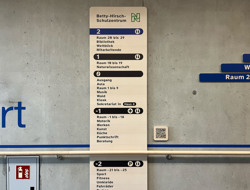
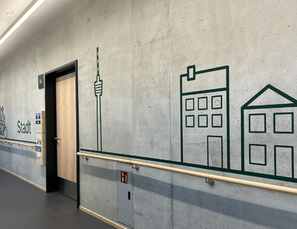
We call our principle 'one for all'. It is a single system for blind, partially sighted, sighted and neurodivergent people. All at once, not as three systems side by side. Grasp, feel, see — and keep your bearings, even when there are too many stimuli.
Not barrier-free, >
For many, barrier-free means harsh contrasts, a rigid grid, no design. That works for people with one impairment. It stays cold for everyone else.
> but for everyone.
Accessibility isn't a trade of 'normal' for 'not normal'. It shifts the perspective. It is a system that works, that is designed and measured and tested. For eyes, hands and attention spans that differ. By the way: DIN 18040 says advertising must not hide orientation information. A sentence you sometimes have to read aloud to a client.
And what does that have to do with your building? >
Everything. Even if no one in your building is blind. Since 28 June 2025, a new German law is in force. It is called the BFSG, the Accessibility Strengthening Act. It comes from an EU directive. It asks for accessible products and services. Websites, apps, machines, terminals. And your door sign? It is not in there. Honestly, not one word.
> The law is only half the story.
The machine in your foyer is in there. So is the site map on your website. For the building itself, the state building codes and DIN 18040 apply. That standard is clear. Whatever warns, guides or points the way must also work for people with limited senses. Further standards say how. DIN 32975 for contrasts, DIN 32984 for floor indicators, DIN 32986 for tactile lettering, DIN 32989 for tactile maps. DIN 18040 is set to align with the European standard DIN EN 17210. The direction is clear. It has never gone backwards. And there is something no law mentions. We grow older. Sight, hearing and attention fade in time. For everyone. A wayfinding system stays on the wall for 15 years. Standards change faster. So since the law came in, we plan every system for tomorrow. School, clinic, museum or public office. Retrofitting is costly. Thinking ahead costs a conversation.
Different faders, >
A school for blind children needs touch and quiet. A clinic needs clarity under stress. A museum needs little text and many languages. A public office needs people who are there for the first and last time.
> same mixing desk.
The faders sit differently every time. The channels are always the same. Who arrives here? What can this person do right now? Which sense is free? And what happens if that sense fails? Four questions. Every project. Always first.
Our eye is >
A healthy eye does not know what a partially sighted one sees. A nervous system with a normal stimulus filter does not know how loud a corridor can be. And now the hard part. Years of design experience do not help here. They get in the way. 'That's how we always do it' is the problem. So we stopped guessing.
> a poor assessor.
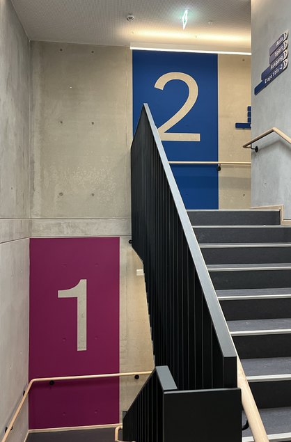
We measured the contrasts. We did not just look at them. Not on the computer either. Calculated values do not know the light in the corridor. Not in January at eight. Not in June at four. They do not know the viewing angle. From a wheelchair, in a narrow hall, from below. Contrast values on screen are like cooking from a photo. Looks good. Says nothing about the taste. So: a measuring device, on site, in real light, each part on its own. To guide, you need a luminance contrast of 0.4. To warn, 0.7. A colour contrast does not count towards it. That is the mistake almost everyone makes.
Design can hurt. >
Fine stripes and hard axes can trigger dizziness in photosensitive epilepsy. Too many moving parts overwhelm attention. Where is the centre? Where does the sign end? Where is up?
> We asked,
We asked, we did not assume. Teachers, staff and pupils walk these halls every day. The standard clearly asks for this. And they spot things no device ever will.
A touch of >
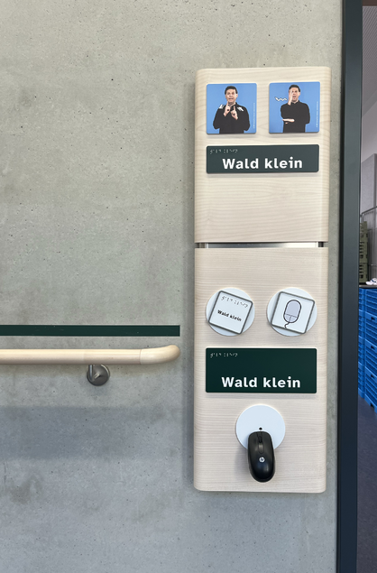
The room and classroom signs were the toughest nut. They have to be legible, tactile, easy to grasp, robust and quiet. Five demands in a single object.
> Gyro Gearloose.
There was nothing on the market that could do it. So we invented it: the Accessible Box. Inside are cables, a pulley, rubber stoppers, wood and sound insulation. Yes, a pulley on a door sign. See for yourself.
Awarded. >
The IIID Award. It is the top global prize for information design.
> Literally.
A second prize is already ours. We can't share it until November, after the ceremony. We are not good at waiting. High-resolution press images: Achim.Bremaier@typenraum.com
Let's talk, >
Building new or renovating? Then this question is already on the table. Fixing it later on the wall is expensive. Talking about it first is one appointment.
> before the signs go up.
be brave: connect your intentions